In the ever-evolving landscape of mobile technology, foldable phones have emerged as a striking blend of innovation and practicality, challenging the very notion of screen real estate. As these devices unfold new possibilities-literally and figuratively-they compel app designers to rethink traditional layouts, interactions, and user experiences. This article delves into how the rise of foldable phones is reshaping app design, exploring the creative adaptations and technical considerations that are transforming the way apps look and behave in a world where screens can bend, twist, and expand.
Table of Contents
- Understanding the Unique Screen Dynamics of Foldable Devices
- Optimizing User Interfaces for Dual-Screen Experiences
- Adapting Navigation Patterns to Flexible Display Modes
- Designing Responsive Layouts for Seamless Folding Transitions
- Incorporating Durability and Usability in App Interactions
- The Conclusion
Understanding the Unique Screen Dynamics of Foldable Devices
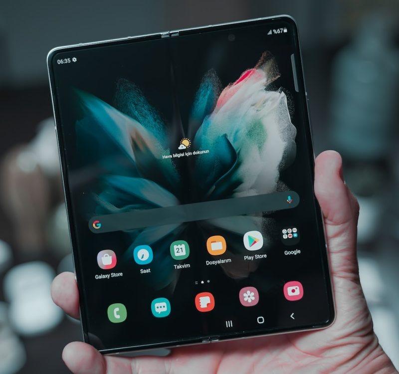
Foldable devices introduce a radical shift from traditional flat screens, offering developers a canvas that dynamically transforms in size and orientation. This flexibility demands a fresh approach to app layouts, where content must seamlessly adapt to various states-folded, unfolded, or partially opened. Unlike fixed screen sizes, foldables challenge designers to anticipate user interactions across multiple modes, ensuring a consistent and intuitive experience.
Key considerations include:
- Screen continuity: Maintaining visual and functional flow as the device transitions between folded and unfolded states.
- Hinge awareness: Designing around the physical fold or crease, which can interrupt content and affect touch responsiveness.
- Multi-window optimization: Leveraging the larger real estate to support simultaneous app usage without clutter.
The complexity grows when factoring in the variety of foldable designs-from vertical clamshells to expansive tablets that fold like books. Each form factor presents distinct challenges and opportunities for app responsiveness and user engagement. For example, an app optimized for a dual-screen foldable might need to manage content across two separate displays, while a single flexible panel requires fluid resizing animations and adaptable UI elements.
| Foldable Type | Design Challenge | App Adaptation Strategy |
|---|---|---|
| Vertical Clamshell | Limited screen space when folded | Compact UI, focus on core tasks |
| Horizontal Book Fold | Hinge crease disrupting layout | Flexible grid layouts and safe zones |
| Dual-Screen | Content continuity across screens | Seamless multi-window support |
Optimizing User Interfaces for Dual-Screen Experiences
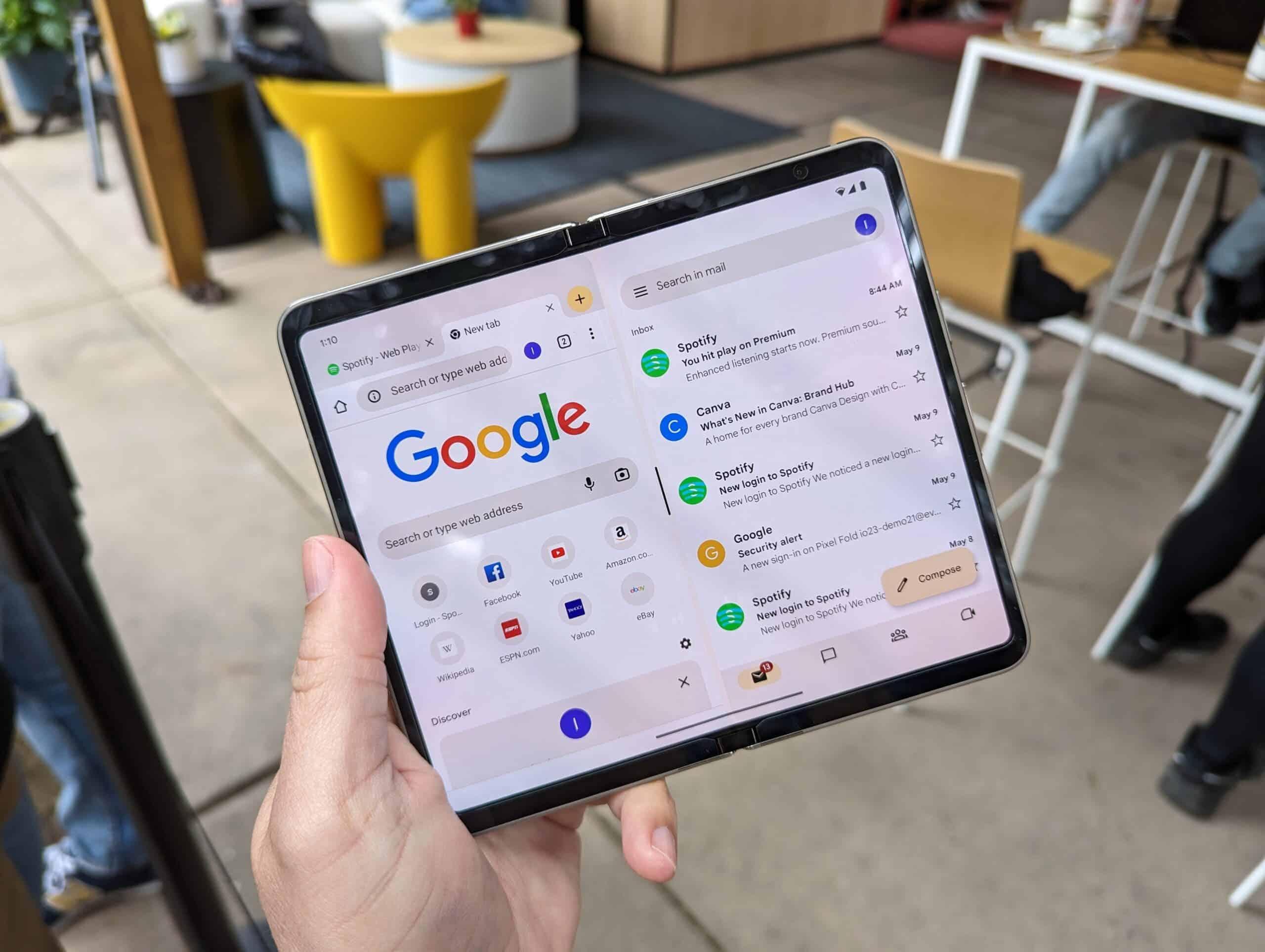
Designing for dual-screen devices challenges traditional UI paradigms, demanding a fresh approach to layout and interaction. Developers must consider how content flows seamlessly across screens, ensuring that users can effortlessly shift their focus without losing context. Instead of a single continuous canvas, the interface becomes a dynamic space divided by a hinge or fold, which can either enhance or hinder usability depending on the design choices.
Key strategies for effective dual-screen UI design include:
- Adaptive layouts: Interfaces should intelligently reconfigure themselves based on the device’s orientation and fold state, optimizing space without overwhelming the user.
- Multi-window multitasking: Leveraging both screens to run complementary app functions simultaneously, increasing productivity and engagement.
- Hinge awareness: Designing around the physical divide to avoid placing critical buttons or content where the fold might interfere with interaction.
Understanding how users interact with two screens also means rethinking gestures and touch targets. For instance, swipe actions can be extended across screens, and drag-and-drop functionality can become more intuitive when content can be moved from one display to the other. The dual-screen experience encourages designers to think beyond single-window constraints, fostering innovation in user journeys.
| Design Element | Single-Screen Approach | Dual-Screen Adaptation |
|---|---|---|
| Navigation | Bottom tab bar | Sidebar on one screen, content on the other |
| Content Display | Single scrollable list | Split detailed and summary views across screens |
| Interaction | Single-touch gestures | Multi-touch and cross-screen gestures |
Adapting Navigation Patterns to Flexible Display Modes
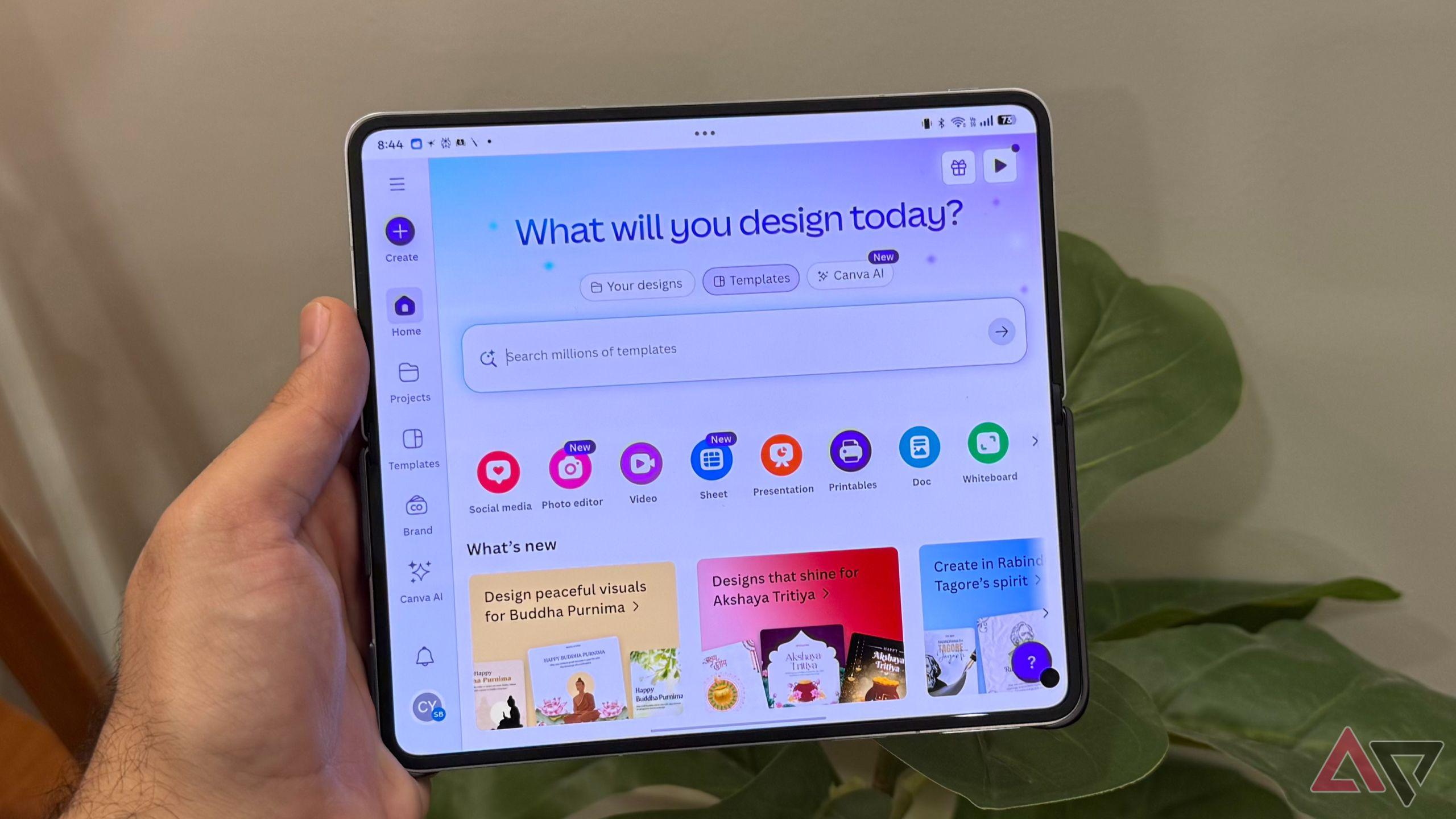
As foldable devices shift the landscape of screen real estate, navigation patterns must evolve beyond traditional static layouts. Designers are challenged to create fluid interfaces that seamlessly adjust between compact and expansive modes without compromising usability. This means rethinking where and how navigation elements appear, ensuring they remain accessible whether the screen is folded or unfolded.
Key strategies include employing adaptive menus that transform from hamburger icons to full tab bars, or using slide-out panels that expand with the screen. Gesture-based navigation also gains prominence, allowing users to interact naturally without cluttering the interface. These approaches help maintain a consistent user experience while making the most of varying display configurations.
- Responsive navigation bars: Dynamically resize or reposition based on screen fold state.
- Context-aware menus: Show relevant options depending on app usage and screen mode.
- Multi-pane layouts: Utilize additional space in unfolded mode for simultaneous content and navigation.
| Navigation Pattern | Folded Mode | Unfolded Mode |
|---|---|---|
| Hamburger Menu | Compact icon | Expanded sidebar |
| Bottom Navigation | Visible tabs | Extended tab bar with labels |
| Gesture Navigation | Swipe gestures | Multi-finger gestures |
Ultimately, navigation in foldable apps must feel intuitive across all form factors. By embracing flexible patterns and prioritizing user context, designers can craft experiences that are both elegant and functional, setting a new standard for mobile interaction.
Designing Responsive Layouts for Seamless Folding Transitions
Creating layouts that respond gracefully to the unique mechanics of foldable devices demands a fresh approach to design. Unlike traditional screen resizing, folding screens introduce dynamic form factors that shift mid-use, challenging developers to anticipate and adapt to rapid changes. This means interfaces must be fluid, capable of reconfiguring content and navigation elements without disrupting the user’s flow.
To tackle this, designers often employ flexible grid systems and media queries tailored to folding states. These allow apps to rearrange components seamlessly-whether the device is fully open, half-folded, or closed. Vital UI elements need to maintain visibility and accessibility while preventing awkward gaps or overlaps that could confuse users.
Consider these essential strategies for smooth transitions:
- Utilize conditional rendering to adjust content density and layout based on fold position.
- Integrate animated transitions that visually guide users through layout changes.
- Prioritize touch target size and placement to accommodate shifting thumb zones.
- Test layouts extensively on both hardware simulators and real devices to catch edge cases.
| Fold State | Layout Focus | Design Challenge |
|---|---|---|
| Fully Open | Maximize screen real estate | Balancing multi-pane content |
| Half-Folded | Maintain readability | Avoiding split-content confusion |
| Closed | Simplify interface | Retaining essential functionality |
Incorporating Durability and Usability in App Interactions
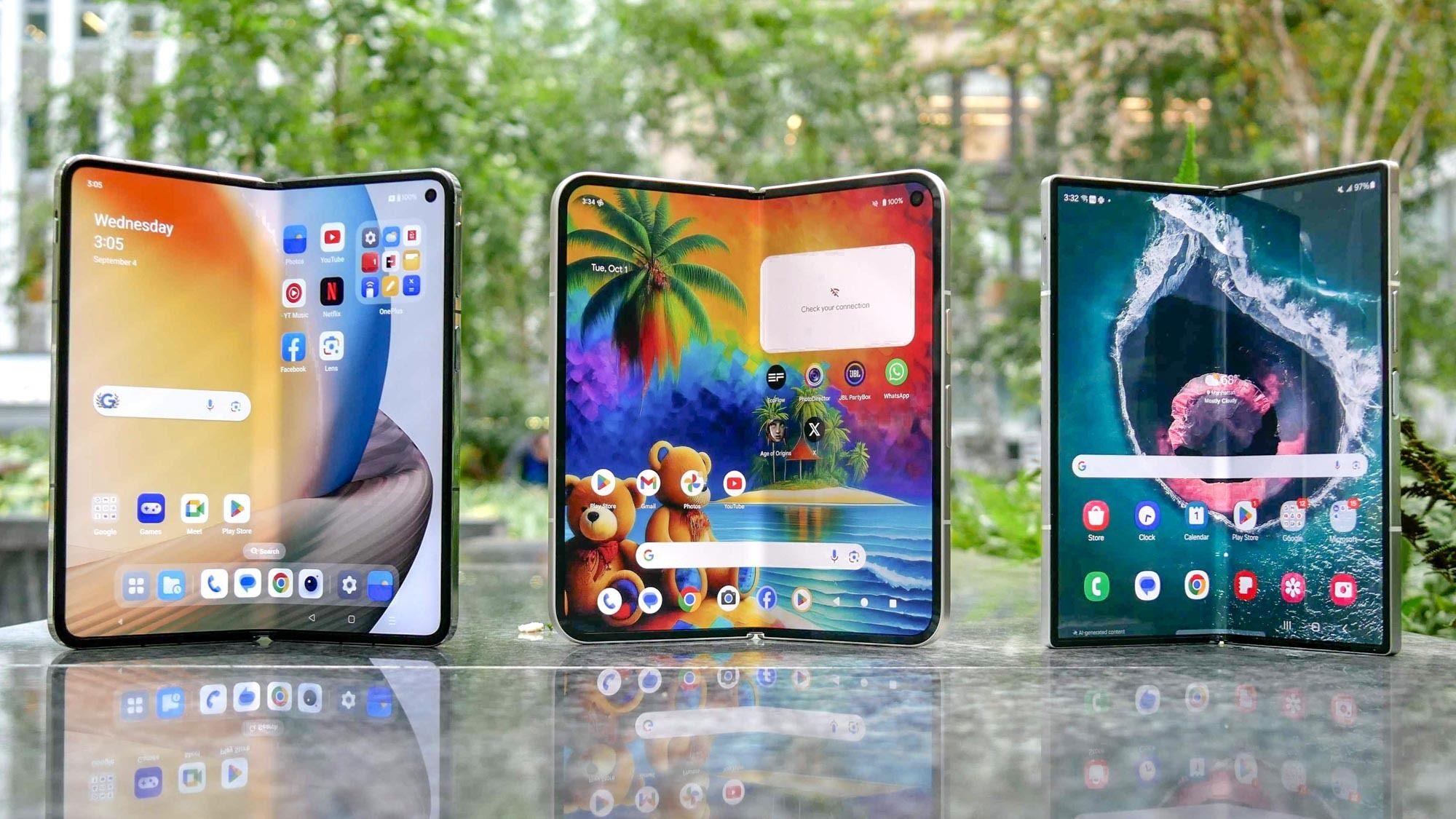
Designing for foldable devices demands a thoughtful balance between durability and usability. App developers must anticipate frequent screen folding and unfolding, ensuring that interactions remain seamless without compromising the device’s hardware longevity. This requires optimized touch targets and adaptive layouts that respond gracefully to changes in screen dimensions and orientation.
One key consideration is the integration of gesture-based controls that minimize physical strain on the device’s hinge and screen. By reducing repetitive taps or drags in vulnerable areas, apps can help prolong the lifespan of foldable components. Additionally, responsive animations should be lightweight and fluid, avoiding any lag that could disrupt user experience during transitions.
Usability also extends to how users interact with split-screen modes and multi-window functionality. Apps must intelligently detect when they are partially visible and adjust their interfaces accordingly-prioritizing essential content and disabling non-critical features to maintain clarity and ease of use.
| Durability Aspect | Usability Focus | Design Strategy |
|---|---|---|
| Hinge Stress Reduction | Minimize repetitive input near folds | Gesture controls & adaptive touch zones |
| Screen Flexibility | Responsive layout changes | Dynamic UI scaling & repositioning |
| Multi-tasking | Clear content prioritization | Partial visibility & feature toggling |
- Energy efficiency: Durable design extends battery longevity by reducing unnecessary redraws.
- Accessibility features: Larger touch targets accommodate variable grip postures.
- Context awareness: Apps adapt behavior based on device folded state for smooth user flow.
The Conclusion
As foldable phones continue to blur the lines between smartphones and tablets, app designers are challenged to rethink traditional layouts and interactions. This evolving landscape invites innovation, pushing developers to craft experiences that fluidly adapt to changing screen dimensions. While the journey is still unfolding, one thing is clear: foldable technology is not just reshaping devices-it’s redefining the very canvas on which our digital lives are painted. Embracing this shift promises a future where apps are more versatile, immersive, and attuned to the dynamic ways we connect with our screens.